
Customer Relationship Manager
When I started working at Expedia our customer service agents were using several different customer relationship managers (CRM), two of which were applications that were built in-house. These legacy applications were used to support different travel products. It was not unusual for Customer Service Agents (agents) to have both CRM applications open, as well as other applications that they needed to complete tasks. The CRM applications were developed in approximately 2000. While updates to existing features and new features were periodically added, constructive feedback from agents and other factors like UX and design inconsistencies led to an application redesign. The biggest contributor to the decision was our move to text-based customer service like chat. The legacy CRMs, both of which were called Voyager, only supported phone-based customer service.
Legacy Voyager CRM
To set context for the multi-year journey, it’s best to give you a glimpse into what Voyager was like back in 2015. Not only did the application show its age and other UX issues, it was overly complex and needed to be significantly simplified. The less time the agent spends wrestling with software and less time they spend with a customer is money in Expedia’s pocket.


Build trust
Heuristic evaluation of the Voyager CRMs, interviews with agents, contextual inquires conducted at contact centers, and feedback from agent operations established a need for change. Even though we had enough qualitative data to justify large changes, there was reluctance to an application redesign. Each department in our organization had time and cost concerns.
A way that I saw to build trust, especially since I was new to Expedia., was to find something smaller and impactful to change. Once they saw the value then perhaps they would get excited for more.
Itinerary redesign
The traveler’s itinerary was the backbone of the Voyager CRM experience. It not only showed the agent what the traveler booked, but it also contained hooks into all the actions that an agent could take on behalf of the traveler, like change or cancel a booking. At the time, there was a different itinerary for each travel product that Expedia offers — Flight, Lodging, Car, Local Activities, and Cruise just to name a few. Each was designed and developed with bespoke layouts, UI controls, iconography and other elements. There might have been some shared elements. But the presentation of those shared elements was not done consistently. The cognitive load for the agents was high.
Redesigning the itinerary was a good first steps since the overall time commitment was low, especially since I was not suggesting any workflow changes. There were multiple design goals that I challenged the team with. The Voyager CRM’s look & feel was dated. The layout needed to be clean, uncluttered and predicable from one travel product to the next. UI controls needed to be designed with reuse and patterns in mind. No more bespoke itineraries. The itinerary redesign would be the first step to designing with a platform mindset or system design.
The designer and the product manager on the project conducted a heuristic evaluation, agent and stakeholder interviews. Once armed with that the data, the designer tested and iterated several times before the engineering team wrote any code.
The agents that were involved with the pre-release usability studies gave such positive feedback. They wanted to know how long they would have to wait before the changes were done.
Itinerary before redesign

Itinerary after redesign

I asked the design team to create agent profiles so that they had a better understanding of the many different customer service agents that Expedia has. There were a lot of complexities that needed to be considered when designing for our agents such as agent tier, experience, and location. Many of the designers on my team hadn’t been to a contact center before. If they had been, it might have been quite some time since their last visit. The majority of the engineers who were developing the Voyager CRM had never been. Creating the agent profiles would help provide context and empathy for the entire organization.


Multichannel Voyager
The legacy Voyager was built on a platform that was not flexible enough to expand to accommodate text-based service. We had to move swiftly and focus on the most necessary scope for the new application. The best place to start was developing the ability for an agent to carry on a text-based conversation with our travelers.
Minimal viable product (MVP)
We had to act quickly to get a text-based CRM up and running. My product and engineering colleagues and I debated the age old question of buy versus build. In the end and after deep cost evaluations, we decided it was best to build the new Voyager in-house since there were monetization opportunities. Additionally, Expedia was on a path to an organization-wide platformization movement. Buying a 3rd-party platform just did not make sense.
An MVP was the best course of action to take. Build the minimum necessary chat feature set so that we can test the software in production with the lowest amount of impact to the agent workforce, engineering and the user experience design teams. The challenge was to design, develop and release the MVP in under a quarter to a ring-fenced agent group. Agents would still have to use the legacy Voyager to take actions like canceling a trip, but they would chat with the customers in the new Voyager.
While it might have been a perfect opportunity for the design team to develop a new design system and language for the new application, there simply wasn’t enough time nor the resources to give it the attention it needed. Since the MVP was not getting a wide release, we opted to spend our time on the UX. I have the team spend the time and resources to developing the new design language and system when the recourses became available.
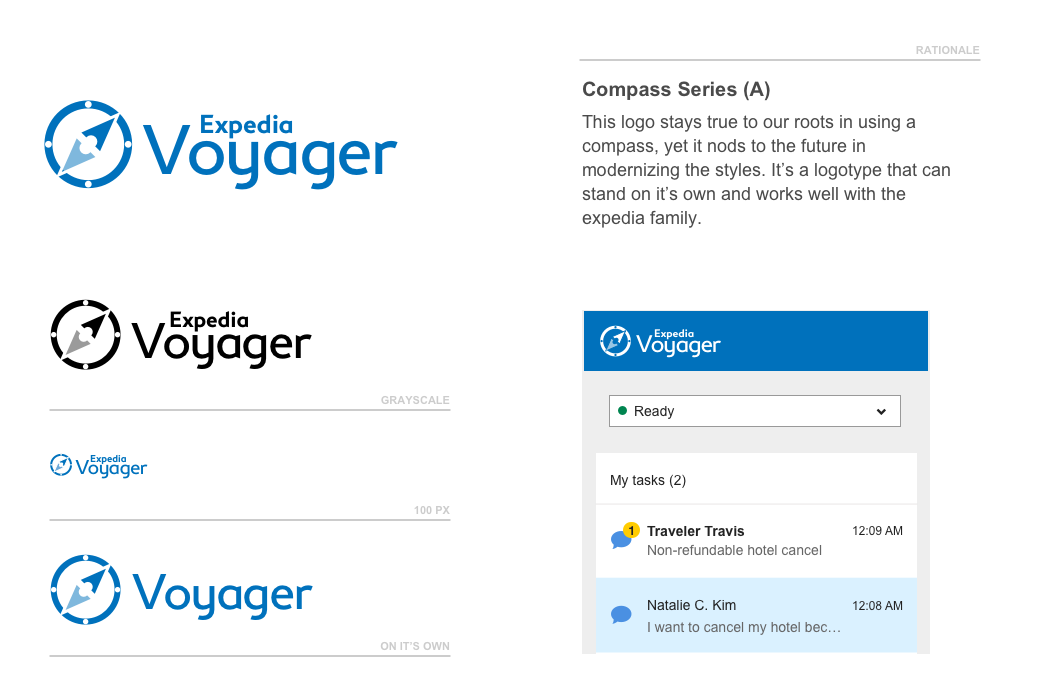
Logo update
We were able to spend a little time on refreshing the Voyager application logo. Several people from my team created designs that were then voted on by a select group. The first design in the following carousel was the winner.


MVP release
The MVP was launched in less than a quarter to a small group of agents. Bugs were ironed out. It took about a year before all chat agents were migrated to the new Voyager.

Multichannel Voyager facelift
My team eventually had some design cycles to begin exploring a brand new look and feel for the new Voyager CRM. The overarching goal for the new Voyager CRM was to bring the product to market as a Travel CRM designed and executed by a travel company. With that in mind I directed my team to do a competitive analysis of other CRMs. By doing so we would be able to differentiate. I wanted the end result of the design to stand out, to delight not only me, the rest of Expedia, and potential purchasing executives, but most importantly our customer service agents. Additionally, the same design goals that I set out for the itinerary redesign applied.
The senior designer I put on this project spent several months iterating. He eventually landed on striking design that literally had agents he had tested the designs with ask when they would be able to have the new Voyager. Senior leadership above me as well as the rest of the organization had such strong positive responses to the outcome.

Voyager design language
Once we landed on the new look and fee, it was time to put energy into a design system. I was keen on the team applying system design to our process to ensure consistency. It was especially important to maintain a consistent visual style, UI controls and layouts. The system would then be applied to a Unified Design System (UDS) and User Experience Toolkit (UITK). The return on investment would pay off by enabling the design and engineering teams to design and build features quickly.
Naming design systems were the rage. The designers on the project named our system “Orion”. The following are a few pages from the early documentation stages. Eventually, and as part of an Expedia-wide platform initiative, our design system merged with a larger UDS/UITK.


Current state
The new Voyager application has evolved. It now has voice, email and chat support capabilities making it truly multichannel. We’ve added bot automation that utilizes the same traveler-related skills but configured to work for agents. The automation helps the agents complete tasks quicker and eliminates costly errors.
